Productizing one of the most fragmented buying experiences in India
You can book a flight online in minutes. A hotel takes even less. Try organizing a wedding, and you are suddenly dealing with venues, decorators, photographers, caterers, makeup artists, transportation, accommodation, entertainment, planners, guest counts, dates, budgets, and dozens of decisions that depend on one another. Most of that market still operates through phone calls, WhatsApp conversations, spreadsheets, referrals, and individual vendors.
Event Planet was trying to turn that fragmentation into a product: a single marketplace where someone could discover and plan weddings, birthdays, anniversaries, corporate events, and destination celebrations, while venues and vendors participated on the other side. When they came to us, the product already existed. The problem was that the experience had not caught up with the ambition. The marketplace is live at eventplanet.in.

This wasn't really an events website
At first glance, Event Planet can look like a discovery marketplace: browse venues, find photographers, compare decorators, request a quotation. Underneath that sits a much more complicated system. A wedding is not one transaction. It is a collection of interconnected purchases with different suppliers, timelines, capacities, locations, and constraints.
The customer side needs inspiration and simplicity. The vendor side needs leads and operational structure. Event Planet sits between them. That meant we were not designing one journey. We were designing a marketplace with two different operating realities.
The product had breadth. The experience hid it.
Event Planet could serve weddings, destination weddings, birthdays, anniversaries, corporate events, and international celebrations. Each could involve venues, event planners, photographers, decorators, caterers, beauty and outfits, transportation, shopping, and packaged experiences. That is valuable inventory. If the architecture does not expose it properly, breadth becomes complexity. A visitor should not have to understand Event Planet’s taxonomy before they can start planning an event. Our first job was not redesigning individual screens. It was understanding the system.
Before touching the visual language, we mapped the existing experience: landing, discovery, package, consideration, and quotation on the buyer side; listing, inquiry, response, and management on the vendor side. We looked at desktop and mobile. The booking journey asked users to make too many decisions before giving them enough value. Important categories appeared too late. Quotation flows asked for information without enough context. Vendor profiles were not structured for fast comparison. The homepage did not communicate the breadth of the marketplace, and mobile behaved too much like a compressed desktop. Those were not independent UI problems. They were symptoms of an information architecture that needed to be reconsidered.
Start with what you are actually planning
We wanted the experience to begin with intent — not with Event Planet explaining itself, not with a giant navigation menu, not with a wall of vendors, but with the user’s event. Once we know what someone is planning, the rest of the marketplace can change around the answer. A birthday does not need the same journey as a destination wedding. A corporate event has different requirements from an anniversary. Someone looking for a photographer does not need the same path as someone looking for an entire wedding package. Marketplace design often becomes complicated because the product starts with its own database rather than the customer’s decision. We wanted to reverse that.
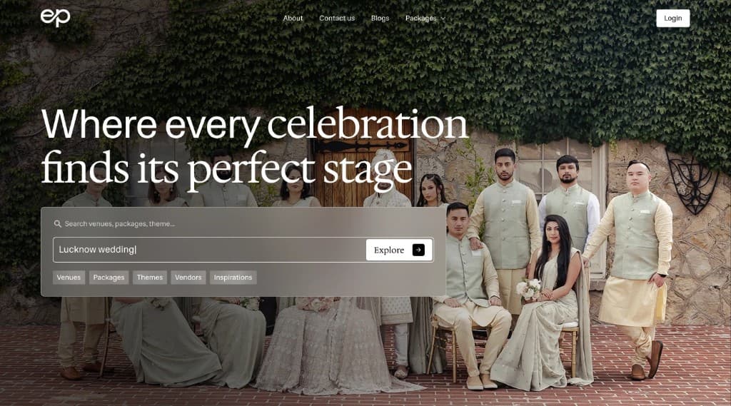
The homepage needed to establish Event Planet’s breadth without overwhelming someone with it. We reorganized it around intent and progressive discovery: search, core service categories, packages by occasion, event-specific quotation paths, venue and partner proof, featured vendors, destination packages, popular venues, and customer evidence. The first question was what do you need. Everything afterwards answered what Event Planet can do about it. That was more useful than trying to explain the entire marketplace above the fold.
Trust mattered differently here. People are not buying software licenses. They are planning weddings, birthdays, anniversaries, and corporate gatherings that happen on a particular date and cannot be patched in production next Tuesday. Beautiful photographs are not enough. Venue partnerships and recognizable hospitality brands became important confidence signals — partners and properties associated with names such as Taj, Hyatt, Marriott, Hilton, and Radisson, alongside featured planners, venues, testimonials, and customer proof. The visual experience could create aspiration. The product experience needed to create confidence.
Event services are notoriously opaque: submit a requirement, wait for a call, explain everything, receive a quotation, change the requirement, receive another quotation, and only then begin to understand cost. Event Planet had an opportunity to move some of that information earlier. Package cards surfaced pricing anchors, guest capacity, room count, inclusions, event type, and destination before asking someone to submit a quotation request. Show enough value before asking for information.
We attacked the booking flow
The existing booking journey had accumulated too many decisions and screens. Every additional step is another opportunity to leave. Simply deleting fields was not enough, because some of that information was genuinely necessary to produce a meaningful quotation. The problem became sequencing: what Event Planet needs to know now, what it can ask later, and what the customer should see before being asked anything at all.
The redesigned journey started with event type. Relevant packages appeared earlier. Commercial information became visible sooner. Only after someone understood what was available did we move toward the quotation flow. The resulting journey used approximately 40% fewer screens from entry to quotation submission than the previous flow. That number matters because it was not achieved by removing necessary context. It came from reordering when decisions happened.
The vendor side was a different product
A marketplace does not work because customers can browse beautifully. It works when supply can actually participate. Venues, photographers, decorators, planners, and other vendors needed to manage listings, maintain profiles, receive inquiries, respond to leads, and understand how their presence on Event Planet was performing. The existing vendor portal did not provide enough structure around those jobs.
We redesigned it around listing management, lead response, and performance visibility. The interface became less about navigating a dashboard and more about helping vendors answer a simpler question: what needs my attention? That is a better organizing principle for an operational product.
Mobile couldn't be the smaller version
A significant amount of discovery in the Indian consumer internet happens from a phone. People browse venues while sitting with family, share options over WhatsApp, look at photographs, compare packages, and jump between conversations and the marketplace. Planning is not happening neatly at a desktop workstation. Mobile was not something we wanted to solve after desktop was approved. We prototyped the buyer journey and vendor experience for smaller screens deliberately — touch targets, information density, scroll, navigation, cards, forms, imagery, comparison, and the sequence in which information appeared. A marketplace this visual can easily become exhausting on a phone. The job was not fitting everything onto the screen. It was deciding what deserved the screen first.
Event Planet’s ambition also extended beyond domestic events, with destination coverage across locations such as Thailand, Mauritius, Nepal, and Vietnam alongside its Indian venue network. The product was no longer only helping someone find a nearby venue. It could help someone ask what a wedding might look like in Mauritius, or what a budget could get in Thailand. Destination, imagery, and pricing anchors had to work together. The experience needed to sell possibility without turning into a travel brochure.
You cannot sustainably design every venue, package, vendor, category, and event type independently. The system would collapse under its own inventory. Alongside the experience redesign, we developed a design system and component library: cards, inputs, navigation, package structures, vendor profiles, content hierarchy, responsive behaviors, and repeated marketplace components. That gave the team a visual grammar for expanding the product without reinventing the interface every time inventory grew. For a marketplace, consistency is not merely aesthetic. It is operational leverage.
The marketplace could become bigger. The experience needed to feel smaller.
Marketplaces have a peculiar design problem. The company benefits from complexity: more vendors, venues, categories, packages, destinations, inventory, and combinations. That is what makes the marketplace valuable. The customer suffers from complexity. They do not want 10,000 possibilities. They want to know what makes sense for their wedding. The design has to preserve the complexity underneath while presenting simplicity above it. That is what we were really redesigning.
We could have made the homepage prettier, redesigned the cards, and reduced form fields. All of those things happened. None of them was the core problem. The deeper question was when the user should have to think about each decision: event type first, relevant options next, commercial context after that, detailed requirements when they are actually necessary, quotation once enough value has been established. The same principle applied to vendors: do not expose the entire administration system; show what needs attention. Good product design often becomes sequencing complexity, not eliminating it.
Event Planet was not trying to invent weddings. The ecosystem already existed. The difficult part was bringing those pieces into a digital system without reproducing all the fragmentation of the offline market inside the interface. Our role was to help structure that system: make discovery easier, bring value earlier, shorten the path to quotation, give vendors a better operating surface, make mobile a first-class experience, and build a design system capable of carrying the marketplace as it expanded. The final product had more capability than before. The user needed to understand less of that complexity at once. The marketplace could become bigger. The experience needed to feel smaller.